Personal Project | Tools Used: Adobe XD
What is Echo Fighters?
Echo Fighters is a project I started with a couple of college friends of mine. The objective was to take the seasonal circuit format, typical of many traditional sports and eSports, and apply it to Super Smash Bros Ultimate (SSBU)—a scene dominated by both online and offline single- or double-elimination tournament brackets.
It was envisioned as a two-stage competitive circuit, with players split into groups for stage one. They'd compete to dominate their group leaderboard, with the best of them going head-to-head with the other groups' finest in a double-elimination bracket to crown the champion of Echo Fighters Season 1 (EF:S1). The winner would walk away with glory and bragging rights, and the inter- and intra-group rivalries and storylines would pave the way for Season 2.
The Problem
While websites hosting competitive Smash tournaments exist (most notably smash.gg), there wasn't much of anything at the time for a sports-style seasonal circuit. Platforms at the time were focused primarily on weekly tournament brackets more so than point-keeping for individual matches. Given that Echo Fighters aimed to be a competitive circuit akin to that of Premier League or the League of Legends LCS, designing a website was something that was always at the front of our minds.
The Process
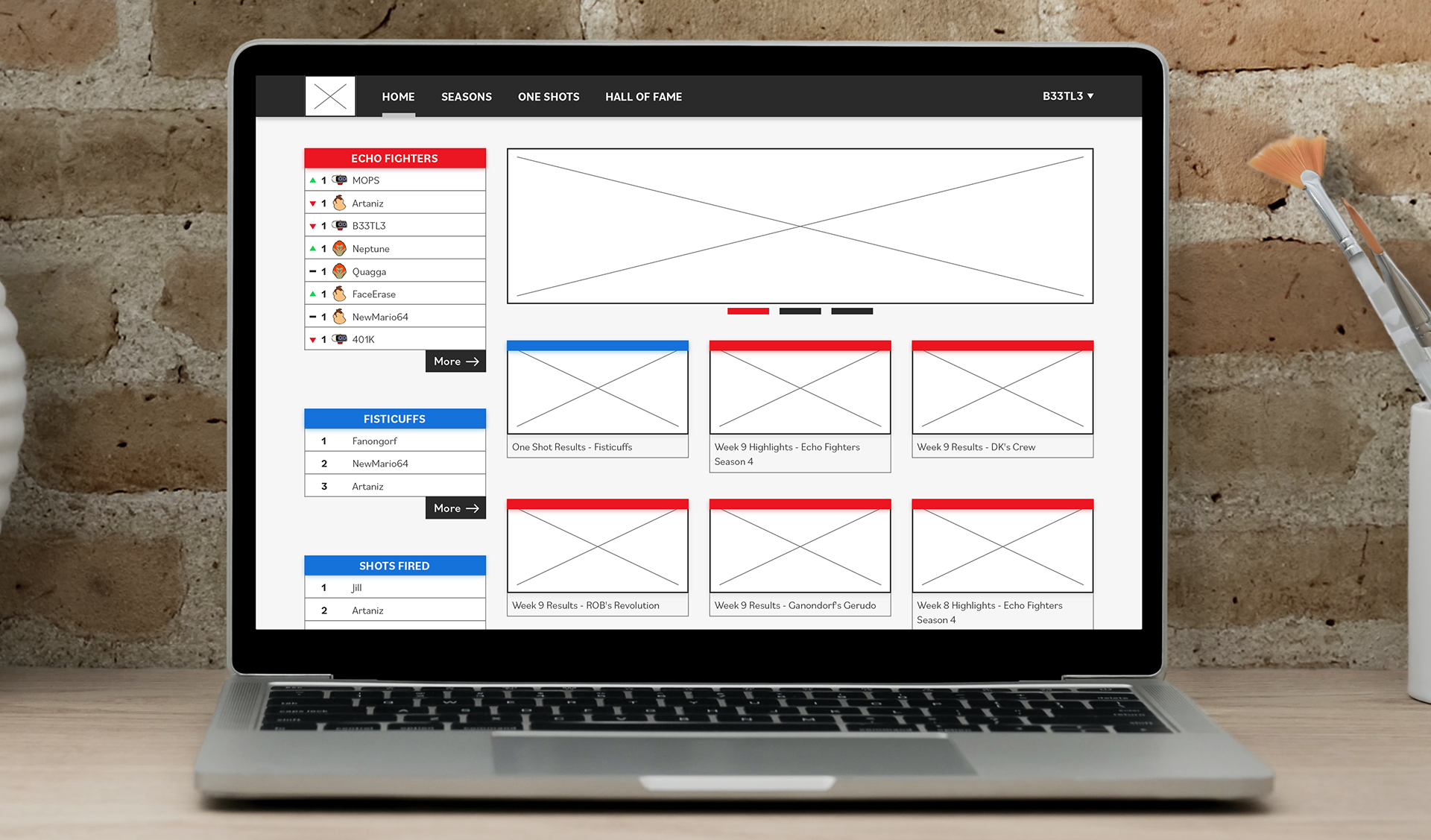
Though we never ended up building a website for the competitive league, I envisioned a standalone Echo Fighters website. A website that took the feedback hosting platform that our players scheduled and reported matches on to heart.
1) User Feedback/Player Interviews - Identifying Pain Points
2) Creating a Prototype - Addressing Pain Points and Shortcomings
3) Small-scale User Testing - Lessons Learned and Prototype Shortcomings
Identifying Problems
Following the ending of EF:S1, I reached out to a number of players to see if they’d be willing to discuss their experience with the site. While I had assumptions of my own as to what could be different from how it currently was, I’m aware that much of my bias could’ve easily been from things just being different on the partner site when comparing it to initial designs my friends and I had discussed during the initial planning stage of the competition. From the couple of people who got back in touch, I was able to identify some common pain points that our players had with everything that wasn’t fighting.
1) Registration
2) Match Scheduling
3) Reporting a Match
4) Checking Rankings, Leaderboards
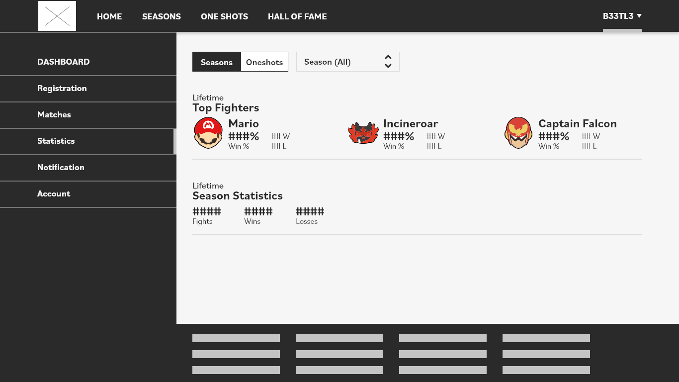
5) Competitor Fighter usage data and statistics - Unexpected!
These pain points were the most touched-upon and most discussed points during my discussions with the players, as well as being issues I had originally thought to be problematic when initially looking back at the platform. The lack of player statistics such as overall win rate and fighter win/loss ratios was something I didn’t expect to see crop up so much—granted, this issue in question came from two players who openly admitted to really liking their stats and data sets.
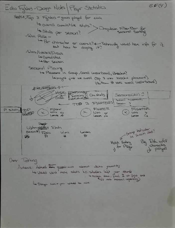
With these pain points in mind, I had a lot of thinking, problem identifying, and sketching to do.
Building a Prototype
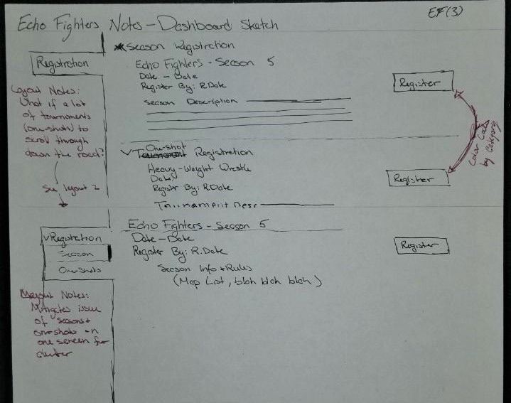
This project ended as less of a site redesign and more of a prototype from the ground-up. I had a handful of critiques about a platform that didn’t meet player expectations, and a pile of notes and sketches.
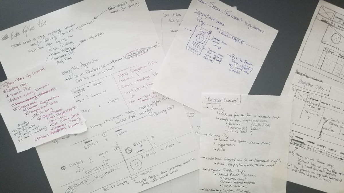

Converting these into a digital format that I’d be able to get in front of former Echo Fighters participants took some doing. I was, for the most part, working without a premade design system, making all my assets from scratch—in hindsight, something that I wouldn’t do again unless utterly necessary.
When I started, I had in mind a set of site instances, pages in the site that would be made up to fill a need or address a pain point identified by users. This wasn’t going to be a full website prototyped in XD by any stretch of the imagination—the joys of working on a small passion project that currently has no future implementation plans.
User Testing & Feedback
It was time for more feedback - and feedback I got. While I was happy with how my mockup had turned out, I had to get these in the hands of some of the players that had provided feedback at the start of this whole adventure. The key instances I wanted to focus on were:
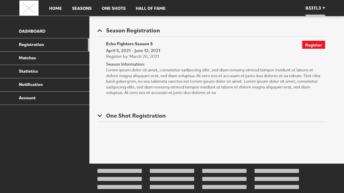
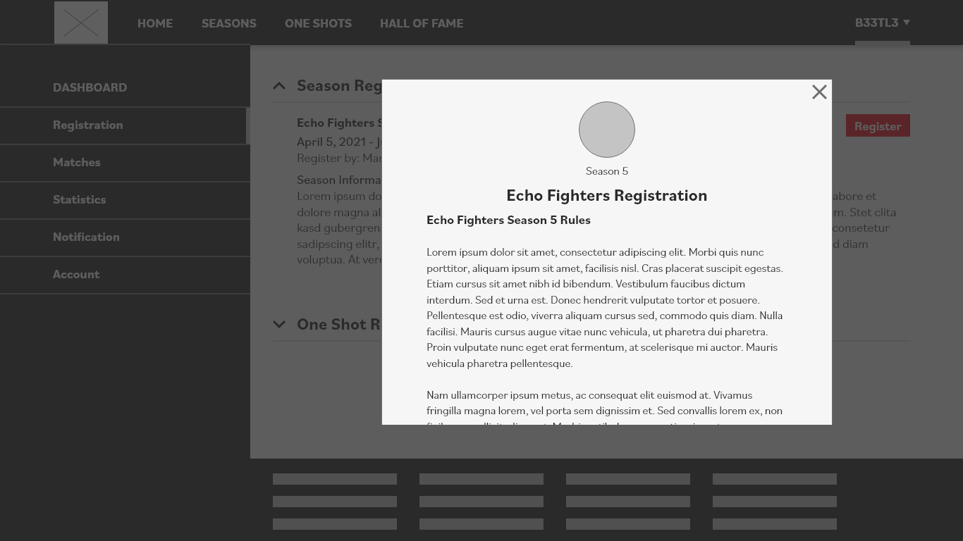
a) Season Registration Flow
b) Season Matches History
c) Match Reporting
c) Player Statistics
a) Season Registration
It turns out, the first place people would seem to look to register for a season is… in the seasons page. I had gotten so focused on the idea of providing an all encompassing dashboard for players to manage their everything from that I had lost sight of just how big of a giant “CLICK ME FOR SEASON INFO” the Seasons tab actually was. I gave two users the task to register for the upcoming Echo Fighters season. Without fail, they both immediately beelined to the “Seasons” tab, pause for a bit, and then went to the Dashboard when nothing on the Seasons page provided any useful registration signifiers. Both of them told me after that they only went to the Dashboard cause it seemed like the only reasonable place it could be based on the main navigation lacking any other options. After that, though, registration was smooth sailing.
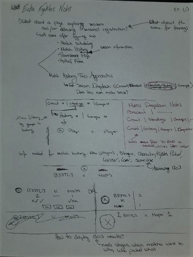
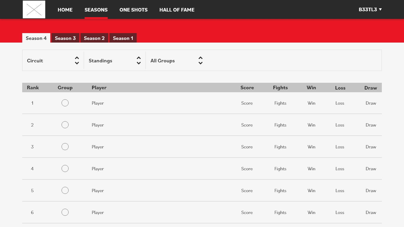
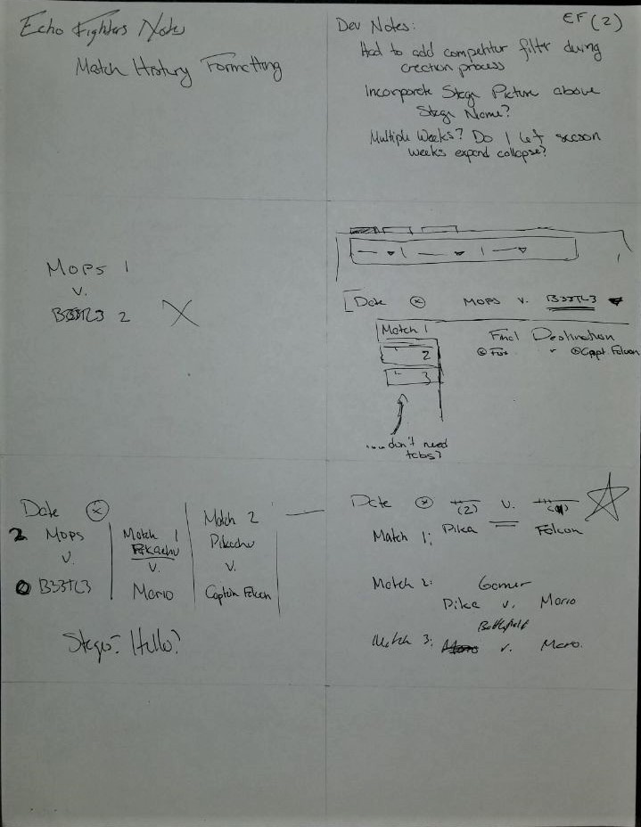
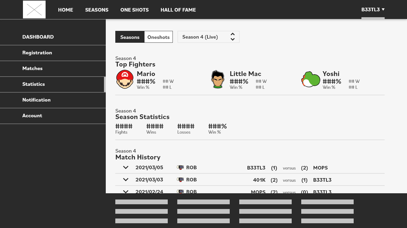
b) Season Matches History
Again they beelined to the Seasons page, although that was actually the correct location this time. Navigation using dropdown filters stumped them though. In one instance, it was due to my lack of wired-up dropdown actually showing what categories were, in another it was that the user just didn’t expect the History to be where it was. Both users did like the match stats and the info given—it was finding the info that proved to be a bit harder to discover than I had anticipated. After prompting them that the dropdowns were, in fact, dropdowns (just unwired ones), that cleared up confusion for them. I severely underestimated just how clear dropdowns made categories, a lesson I’m not likely to ever forget.

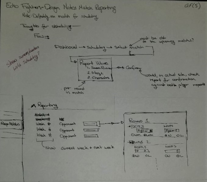
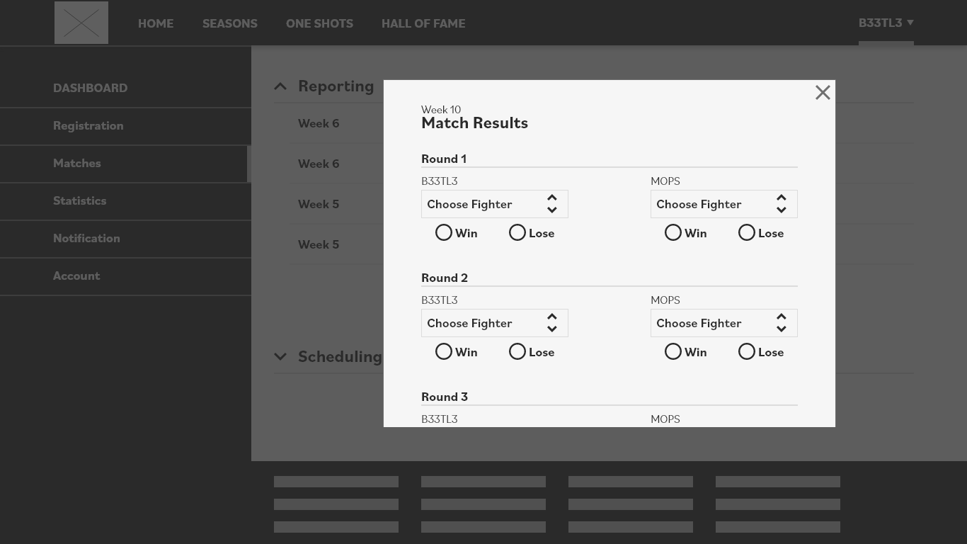
c) Match Reporting
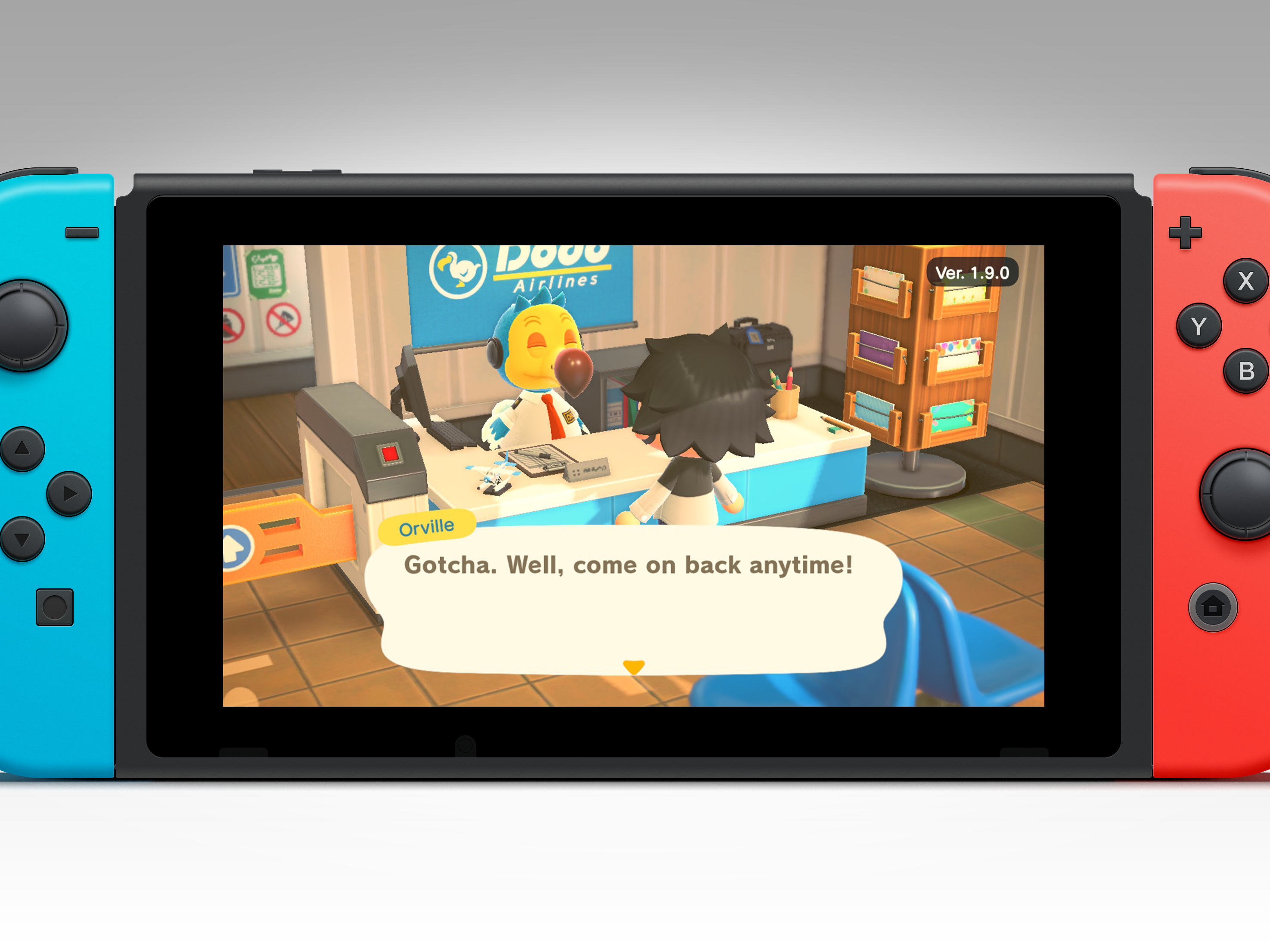
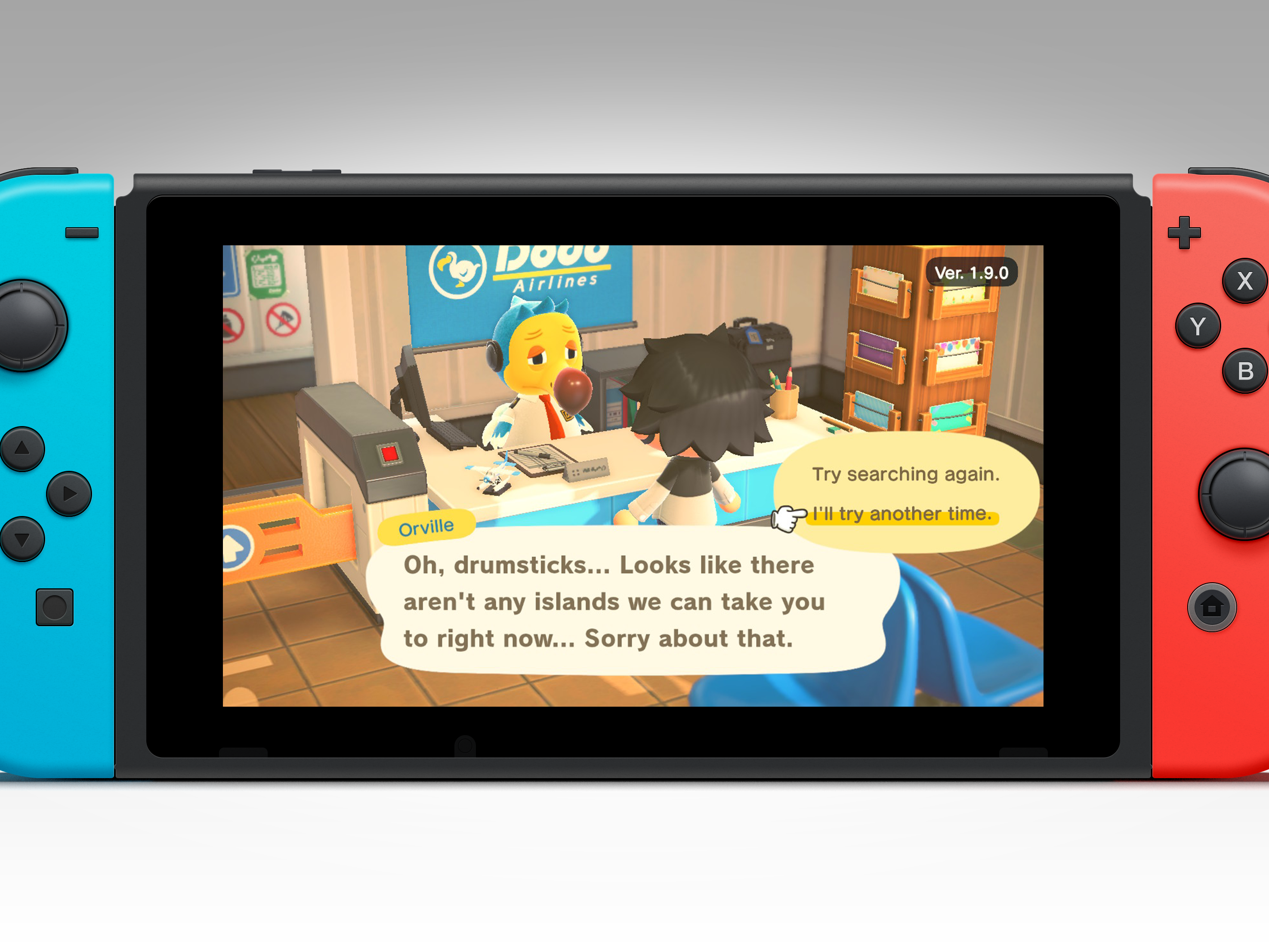
Match reporting was a constant complaint that our players had. Though I unfortunately lack screenshots of the old platform, trying to report a match after a best of 3 set was confusing, to say the least. Players would go to report and would be presented with an unsorted and undated list of all of their upcoming matches for the entire ten-week season. This led to some really weird false reporting happening, not due to any fault of the user. For example, If B33TL3 fights MOPS in Weeks 4 and 8, and it is currently Week 4, it wouldn't have been surprising to see B33TL3 report Week 4's fight as Week 8, and then having to report Week 8's fight as Week 4 further on. To remedy this, I simply made sure to have a
Double reports also came up quite frequently for the first few fights of the season, as there was nothing stopping both participants in a match from reporting the results and creating a double result that would count the resulting score twice. In order to ensure this couldn't happen in a future version of Echo Fighters, I created three assumed states of a match
"Reported" state: Match results have been submitted by both players checked against each other, and confirmed to be identical, leading to a successful result report
"Pending..." state: Match results have been submitted by only one of the two players. The player that has yet to submit results would see the "Reported" state on their dashboard.
"Submit" state: Match results have not yet been submitted.

d) Player Statistics
This was a question of how useful and comprehensive player statistics were—statistics being important for the “numbers people” who want to scout out their opponents or get a feel for how strong players are on certain stages and characters. The feedback on the Players Stats pages, coupled with the information that displays in Match Histories, were met was overall positive. One thing I didn’t expect was that one former player made their own spreadsheets over the course of the season. The statistics presented in the mockups were great, they said—they just would want more numbers. Stats I hadn’t even considered, such as damage % at the end of matches, remaining stock counts, and match time left so they could create an even more fleshed out data set of players. They also realized that some of that would be difficult for players to submit manually, and prefaced their feedback noting that.
Lessons Learned & Future Plans
My main lesson here was that I should just make things and fail faster if necessary. This project took me much longer than it ever should have to do, because it took quite some time to get out of the brainstorming and sketching phase and actually start making the mockups to get in front of our users. I can sketch stuff for days, but if I don’t ever convert it to something nearing its intended form, I can’t test and change things. I can't get meaningful feedback until there's something that people can mess around with and get lost in during testing.
The benefit of this being a side project is that deadlines were relatively soft. The downside of this being a side project is that the deadlines were relatively soft. I made most of my assets from scratch, and spent far too much time trying to get things looking perfect rather than being good enough.
In the end, finally ending this chapter of Echo Fighters felt good, and I learned a lot about creating my own design process, identifying actionable bits of user feedback, and familiarized myself more with Adobe XD.
...
... Organizing notes helps, too. Having notes spread across various mediums, as either hard copies, soft copies, or both, quickly got unmanageable until I started consciously filing and labeling things.